
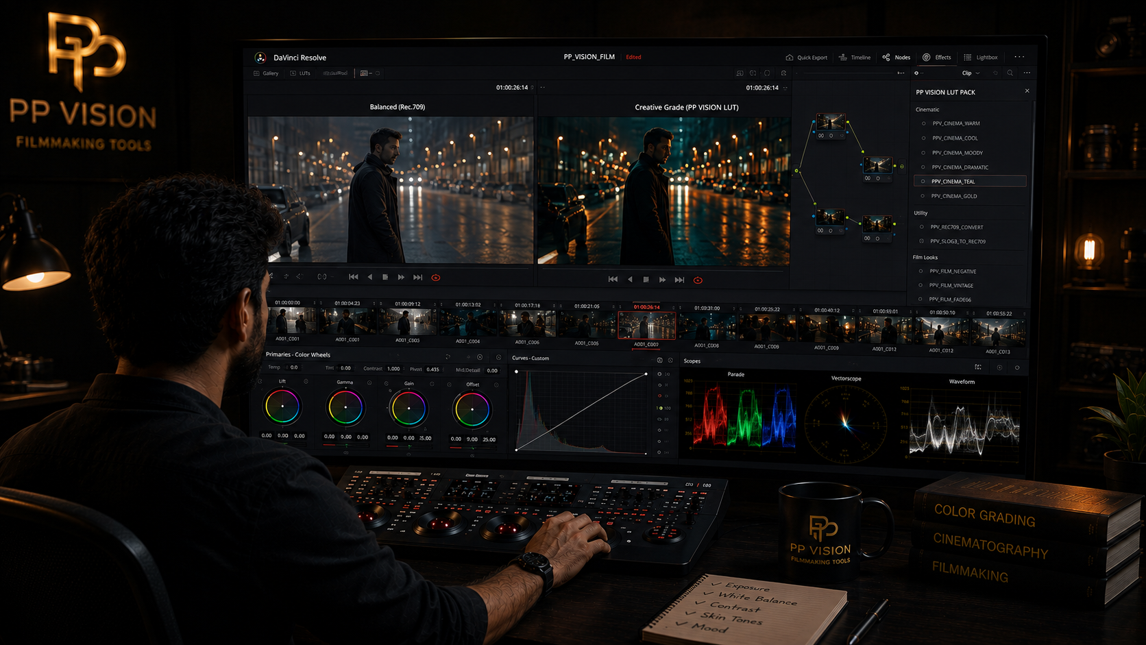
Color Correction vs Color Grading: What's the Difference?
Color correction and color grading are often used interchangeably, but they are not exactly the same thing.
Both are part of the color finishing process, but they solve different problems.
Color correction focuses on creating a balanced and consistent image.
Color grading focuses on creating the final visual style and mood.
Understanding this difference makes it much easier to build a clean grading workflow, whether you are working in DaVinci Resolve, Premiere Pro, or another color-grading application.
What Is Color Correction?
Short answer: Color correction is the process of balancing footage so that it has a controlled, consistent, and usable starting point.
Color correction can involve adjustments to:
Exposure
White balance
Contrast
Shadows
Highlights
Saturation
Color balance
For example, imagine you shot a scene using multiple camera angles.
One shot looks slightly blue.
Another is warmer.
A third shot is darker.
Before creating a creative look, these differences should usually be addressed.
The goal is to make the shots feel like they belong together.
What Is Color Grading?
Short answer: Color grading is the creative process of shaping the appearance of footage to create a specific mood, style, or visual identity.
After the footage has been balanced, you can make creative decisions such as:
Making highlights warmer
Making shadows cooler
Reducing overall saturation
Increasing contrast
Creating softer highlights
Emphasizing specific colors
Creating separation between the subject and background
The goal is not necessarily to make the image look "correct."
The goal is to make it look intentional.
Color Correction vs Color Grading
The simplest comparison is:
Color Correction | Color Grading |
|---|---|
Fixes and balances footage | Creates visual style |
Corrects exposure | Shapes contrast |
Corrects white balance | Shapes color relationships |
Matches shots | Creates mood |
Removes unwanted color casts | Adds creative color |
Creates a stable starting point | Creates the final look |
In practice, the two processes can overlap.
There is no universal rule that every colorist must follow.
But thinking about them as two different stages makes the workflow easier to understand.
Why Do You Need Color Correction?
Cameras do not always produce perfectly consistent images.
Even during the same shoot, footage can vary because of:
Changing natural light
Different camera angles
Different lenses
Different exposure
Mixed lighting
Different white-balance settings
Multiple cameras
Changing locations
Without correction, these differences can become distracting.
Imagine a dialogue scene where the first shot has neutral skin tones and the reverse shot suddenly looks orange.
The viewer may not consciously identify the problem, but the scene can feel inconsistent.
Color correction helps create continuity.
Why Do You Need Color Grading?
Once the footage is balanced, you can decide how the scene should feel.
For example, imagine a night scene.
You might choose to:
Lower overall saturation
Push shadows slightly cooler
Keep skin relatively warm
Reduce distracting background colors
Increase contrast
Control highlights
None of these decisions are necessarily corrections.
They are creative choices.
That is the role of grading.
A Simple Example
Imagine you have this original shot:
Original footage
The image is slightly underexposed and has a green color cast.
Color Correction
You might:
Raise exposure
Correct the green cast
Adjust white balance
Set appropriate contrast
Balance saturation
Now the image looks natural and controlled.
Color Grading
You might then:
Add warmer highlights
Make shadows slightly cooler
Reduce background saturation
Increase subject separation
Shape the contrast
Now the image has a deliberate visual style.
The first stage solved problems.
The second stage created the look.
Does Color Correction Need to Happen Before Color Grading?
Usually, establishing a balanced image before creating the final creative look makes the workflow easier.
But the exact order can change depending on the project and grading system.
For example, color management or technical transformations may happen at different points in the pipeline.
A creative LUT may also expect a specific input condition.
So instead of following a rigid rule such as "always correct first," understand what each stage of your workflow is doing.
A useful general workflow is:
Input → Balance → Match → Creative Look → Finishing
What Does Color Correction Usually Involve?
Exposure
Exposure is one of the first things to evaluate.
Check:
Shadows
Midtones
Highlights
Overall brightness
The goal is to establish a useful tonal starting point.
White Balance
If the image has an unwanted blue, orange, green, or magenta cast, white balance adjustments can help neutralize it.
However, not every color bias is a problem.
Sometimes a warm or cool appearance is intentional.
Contrast
Contrast controls the relationship between darker and brighter areas.
You might need to increase or reduce contrast depending on the footage.
Saturation
Saturation controls the intensity of colors.
Too little saturation can make footage feel dull.
Too much can make skin and other colors look unnatural.
Shot Matching
Shot matching is especially important when multiple clips need to work together.
The goal is not to make every shot identical.
The goal is to create visual continuity.
What Does Color Grading Usually Involve?
Creative Contrast
You can use contrast to establish the visual character of a scene.
For example:
Strong contrast for drama
Softer contrast for a gentle look
Controlled highlights for a polished appearance
Color Relationships
Instead of simply adding more color, think about relationships.
For example:
Warm subject + cooler background
or:
Muted environment + controlled accent color
These relationships can help direct attention.
Skin Tone
Skin tones often need special attention because viewers are highly sensitive to unnatural skin color.
A creative grade should support the subject rather than make skin look excessively orange, red, or magenta.
Selective Color
Sometimes only part of the image needs a creative adjustment.
You might change:
Sky
Foliage
Clothing
Background
Highlights
Shadows
This is where secondary color corrections can become useful.
Where Do LUTs Fit?
LUTs can be used during color correction or color grading depending on their purpose.
This is why it is important to understand what a LUT is designed to do.
A technical LUT may be intended to transform one image representation into another.
A creative LUT may be designed to create a particular visual style.
A camera-specific creative LUT may be designed around a particular gamma and color-space combination.
So before applying a LUT, ask:
What does this LUT expect as its input?
And:
What does it produce as its output?
Applying the wrong LUT can create excessive contrast, saturation, or color shifts.
For a deeper explanation, see our guide:
What Is a LUT? How LUTs Actually Work in Color Grading
Color Correction and Color Grading in DaVinci Resolve
DaVinci Resolve separates many color tools into a node-based workflow.
A simple setup could be:
Node 1 → Color Correction
Node 2 → Shot-Specific Correction
Node 3 → Creative Grade
Node 4 → Skin or Secondary
Node 5 → Finishing
You do not need this many nodes for every shot.
The purpose is simply to keep different types of adjustments organized.
DaVinci Resolve's Color page is designed around balancing footage first and then building creative looks, with primary correction tools, secondary tools, nodes, scopes, and other grading controls available within the workflow.
Do You Need to Color Correct Every Shot?
Not necessarily.
Some footage may already be well balanced.
For example, a controlled interview shot from a consistent camera setup may require only minor adjustments.
The important thing is to evaluate the footage instead of applying the same correction automatically.
If the image already works, do not "fix" something that is not broken.
Do You Need to Color Grade Every Video?
Not necessarily.
Some videos may only need basic correction.
For example:
Quick social media content
Simple tutorials
Fast-turnaround videos
Some interviews
Certain documentary workflows
Other projects benefit much more from a creative grade.
For example:
Films
Commercials
Wedding films
Music videos
Narrative projects
Brand films
The amount of grading should match the project.
Common Mistakes
1. Applying a Creative Look Before Fixing Major Problems
If the footage has serious exposure or white-balance issues, a creative LUT or look may make those problems harder to manage.
Better approach: Establish a controlled image first.
2. Thinking Color Correction Means Making Everything Neutral
Correction does not mean removing every creative color decision.
A warm sunset should still look warm.
A blue night scene does not need to become completely neutral.
3. Increasing Saturation to Make Footage Look Better
More saturation can quickly make footage look artificial.
Use saturation with control.
4. Matching Every Shot Perfectly
Continuity matters, but every shot does not need identical color values.
Lighting naturally changes.
The goal is visual consistency, not mathematical sameness.
5. Using LUTs Without Understanding Their Input
A LUT designed for one gamma or camera profile may not behave correctly on another.
Always check the intended input.
6. Over-Grading
A grade should support the image.
If viewers notice the grade before they notice the scene, it may be too strong.
A Practical Color Workflow
For a simple project, you can use this process:
Step 1 — Identify the Footage
Know the camera, gamma, color space, codec, and recording format.
Step 2 — Establish the Correct Pipeline
Make sure your color-management or transformation workflow matches the footage.
Step 3 — Correct Exposure
Establish a controlled tonal range.
Step 4 — Correct White Balance
Remove unwanted color casts where necessary.
Step 5 — Match the Shots
Make the sequence visually consistent.
Step 6 — Create the Creative Look
Shape contrast, saturation, color relationships, and mood.
Step 7 — Make Selective Adjustments
Refine skin, subject, background, or specific colors when necessary.
Step 8 — Review the Sequence
Watch the entire scene rather than judging one frame.
Step 9 — Check the Final Output
Evaluate the image in the intended delivery workflow.
Final Takeaway
Color correction and color grading are different stages of the same larger process.
Color correction creates consistency.
Color grading creates visual intent.
A practical workflow is:
Balance → Match → Create the Look → Refine → Review
Once you understand this distinction, grading becomes much easier to approach.
Instead of asking:
"What LUT should I use?"
start by asking:
"What does this footage need?"
That simple question can prevent a lot of unnecessary grading work.
Frequently Asked Questions
What is the difference between color correction and color grading?
Color correction focuses on balancing footage, fixing issues, and matching shots. Color grading focuses on creative decisions that establish mood, style, and visual character.
Which comes first, color correction or color grading?
In many workflows, the footage is balanced and matched before the main creative look is created. However, the exact order depends on the color-management system, transformations, and grading workflow.
Can color correction make footage look cinematic?
Correction can improve the image and create consistency, but the cinematic character usually comes from the combination of production decisions and creative grading.
Is color grading the same as using a LUT?
No. A LUT is a predefined transformation, while color grading is the broader process of balancing, shaping, and creatively controlling the image.
Do I need to color correct before applying a LUT?
It depends on the LUT. Always check what input the LUT expects. A technical LUT and a creative LUT may require different placement in the workflow.
Can I color grade without color correction?
You can make creative adjustments to uncorrected footage, but building the creative look on top of inconsistent footage can make the workflow harder to control.
Is color correction necessary for Log footage?
Log footage generally requires an appropriate transformation or color-management workflow before it can be evaluated as a normal display image. The exact process depends on the camera and recording profile.
Is color grading necessary for every video?
No. Some projects only need basic correction, while narrative, commercial, wedding, and other visually driven projects may benefit from more extensive creative grading.