
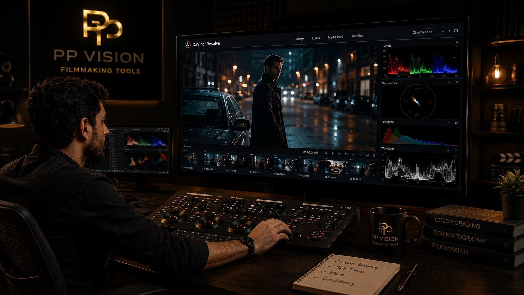
Color Grading Explained: A Practical Guide for Filmmakers
Color grading is more than making footage look cinematic. It is the process of shaping color, contrast, and tone to create consistency, mood, and visual intent.
A good grade starts with a technically usable image and then builds a creative look around the story.
Whether you are working on a short film, wedding video, YouTube project, commercial, or documentary, understanding the fundamentals of color grading can make your footage look more consistent and professional.
In this guide, we will explain what color grading is, how it differs from color correction, the tools involved, and a practical workflow you can use in DaVinci Resolve.
What Is Color Grading?
Short answer: Color grading is the creative process of adjusting the color, contrast, and overall appearance of footage to create a specific look, mood, or visual style.
Color grading usually comes after the image has been balanced.
Before creating a creative look, footage may need adjustments to:
Exposure
White balance
Contrast
Saturation
Color balance
Shot consistency
Once the image is balanced, creative decisions can be made.
You might make highlights warmer, control the shadows, reduce saturation, increase contrast, or create separation between the subject and background.
These decisions form the creative grade.
The goal is not simply to make an image more colorful.
The goal is to make deliberate visual decisions that support the scene and the story.
Color Correction vs Color Grading
Color correction and color grading are closely related, but they serve different purposes.
Color Correction | Color Grading |
|---|---|
Fixes image problems | Creates visual style |
Balances exposure | Shapes contrast |
Corrects white balance | Shapes color relationships |
Removes unwanted color casts | Creates mood |
Matches shots | Creates consistency and style |
Creates a usable starting point | Adds creative intent |
A simple way to remember the difference is:
Color correction asks: "Does this image look right?"
Color grading asks: "How should this image feel?"
In real-world workflows, the two processes can overlap. The important thing is understanding whether you are correcting a problem or making a creative decision.
Why Does Color Grading Matter?
Color has a strong effect on how viewers perceive a scene.
A warmer image can feel inviting, nostalgic, or intimate.
A cooler image can feel distant, quiet, or tense.
Higher contrast can create a stronger and more dramatic appearance, while softer contrast can create a gentler look.
But there is no single "cinematic" color grade.
A wedding film, documentary, commercial, music video, and thriller may all require completely different treatments.
Good grading starts with the footage and the story rather than a preset look.
The Three Main Goals of Color Grading
A practical grading workflow usually has three major goals.
1. Create a Usable Image
Before creating a creative look, establish a solid foundation.
Check:
Exposure
White balance
Contrast
Black levels
Highlight levels
Saturation
Unwanted color casts
If the foundation is wrong, creative adjustments become much harder to control.
2. Match Your Shots
A professional project rarely contains just one shot.
You may have different:
Camera angles
Lenses
Lighting conditions
Locations
Exposure levels
White-balance settings
These shots should feel like they belong to the same scene.
Shot matching is one of the most important parts of professional color work.
3. Create the Final Look
Once the footage is balanced and matched, you can create the creative look.
This may involve:
Contrast shaping
Highlight control
Shadow color
Saturation
Skin-tone refinement
Color separation
Selective adjustments
Film-inspired characteristics
The look should support the footage instead of fighting it.
A Practical Color Grading Workflow
You do not need a complicated node tree to start grading effectively.
A simple workflow is often easier to control.
Step 1: Understand Your Footage
Before changing anything, identify what you are working with.
Ask:
What camera was used?
Was the footage recorded in Log?
Was it shot in RAW?
What gamma and color space does it use?
Has the footage already been transformed?
Is the exposure usable?
Are the shots consistent?
This matters because different cameras and recording profiles require different approaches.
Log footage should not automatically be treated the same way as standard gamma footage.
Step 2: Establish the Correct Color Pipeline
This is where many beginners get confused.
If your footage uses a Log profile or wide-gamut color space, you need to understand how that footage is being transformed for viewing and grading.
Depending on your software and workflow, this may involve:
Color management
Input transforms
Output transforms
LUTs
Color Space Transforms
There is no single correct setup for every camera.
The important rule is:
Know what transformation your footage needs before adding additional transforms.
This is especially important when using LUTs.
Applying multiple transformations without understanding what each one is doing can produce incorrect contrast, color, or saturation.
Step 3: Balance Exposure and Contrast
Start with the basic image.
Adjust:
Overall brightness
Contrast
Black levels
Highlight levels
Midtones
Do not try to create the final look immediately.
Your goal is to establish a stable image that can be compared against the other shots.
Step 4: Correct White Balance
White balance has a major effect on the entire image.
If daylight footage looks too blue or an interior shot looks too orange, correct the imbalance before making creative color decisions.
A practical approach is:
Find something that should appear neutral.
Check whether it looks neutral.
Adjust temperature.
Adjust tint if necessary.
Recheck skin tones and the rest of the image.
However, do not assume every image needs to be perfectly neutral.
A warm or cool bias can be part of the intended look.
Step 5: Use Scopes
Your eyes are important, but they should not be your only reference.
Display conditions, monitor calibration, room lighting, and visual adaptation can affect how you perceive an image.
Scopes provide an objective reference.
Waveform
The waveform helps evaluate brightness and tonal distribution.
It can show where shadows, midtones, and highlights are sitting.
RGB Parade
The RGB Parade helps identify differences between the red, green, and blue channels.
It can reveal color imbalances that may not be obvious by eye.
Vectorscope
The vectorscope helps evaluate hue and saturation.
It is particularly useful when checking skin tones and overall color intensity.
Histogram
The histogram shows the overall distribution of tonal values and provides a quick overview of where image information is concentrated.
You do not need to stare at scopes throughout the entire grade.
Use them as objective reference tools while your eyes make the creative decisions.
Primary vs Secondary Color Corrections
Color grading tools can broadly be divided into global and selective adjustments.
Primary Corrections
Primary corrections affect the overall image.
Typical adjustments include:
Exposure
Contrast
White balance
Saturation
Shadows
Midtones
Highlights
These adjustments usually establish the foundation of the grade.
Secondary Corrections
Secondary corrections affect selected parts of the image.
For example, you might isolate:
Skin
Sky
Grass
Highlights
Shadows
A specific hue
A particular object
DaVinci Resolve provides tools such as qualifiers, Power Windows, curves, and tracking for selective adjustments.
The important thing is not to use selective tools simply because they are available.
Use them when the image actually needs selective treatment.
How Nodes Fit Into Color Grading
If you use DaVinci Resolve, you will eventually work with nodes.
Nodes allow you to organize different corrections and creative adjustments.
A simple node structure might look like:
Node 1 → Balance
Node 2 → Contrast
Node 3 → Skin
Node 4 → Creative Look
Node 5 → Finishing
This can make the grade easier to understand and modify.
But remember:
More nodes do not automatically mean a better grade.
A clean five-node grade can be much easier to manage than a confusing twenty-node tree.
Build nodes around specific tasks rather than trying to make the node graph complicated.
Where Do LUTs Fit Into Color Grading?
LUTs are another area where beginners often get confused.
A LUT is not automatically a complete color grade.
Depending on how it was designed, a LUT may be intended for:
Technical transformation
Creative styling
Monitoring
Film emulation
A specific camera or profile workflow
You therefore need to understand what the LUT expects as its input and what it produces as its output.
For example, a LUT designed specifically for Sony S-Log3 footage should not automatically be assumed to work correctly on unrelated footage.
This is one reason camera-specific LUT workflows can be useful.
Instead of treating every camera image as interchangeable, a LUT can be designed around a known camera profile and input.
The important question is not:
"Is this LUT good?"
It is:
"Is this LUT designed for the footage I am using?"
How to Create a Cinematic Color Grade
There is no universal "cinematic" setting.
Cinematic images can look very different from one project to another.
Instead of copying a preset, focus on the characteristics you want.
Start With Contrast
Contrast has a major effect on the visual style of an image.
You might choose:
Deeper blacks
Softer blacks
Stronger contrast
Softer contrast
Controlled highlights
More midtone separation
The right choice depends on the scene.
Control Saturation
More saturation does not automatically mean better color.
Over-saturated footage can make skin look unnatural and cause background colors to compete with the subject.
Try controlling saturation carefully rather than simply increasing global saturation.
Protect Skin Tones
Skin is often one of the first things viewers notice when a grade feels wrong.
If skin becomes too orange, red, magenta, or desaturated, the entire image can feel unnatural.
Use scopes and selective corrections when necessary, but always evaluate skin in the context of the complete shot.
Build Color Contrast
Color contrast does not always mean extreme complementary colors.
You can create separation with subtle relationships such as:
Warm skin and cooler backgrounds
Warm highlights and neutral shadows
Cooler shadows and warmer midtones
Muted backgrounds and stronger subject colors
Small differences can be enough.
Common Color Grading Mistakes
1. Grading Before Balancing
Trying to create a look before fixing exposure and white balance often creates unnecessary problems.
Better approach: Establish a stable foundation first.
2. Using Too Much Saturation
Increasing saturation is one of the easiest ways to make footage look over-processed.
Better approach: Increase saturation carefully and control individual colors when necessary.
3. Making Everything Teal and Orange
The teal-and-orange look can create strong separation between warm skin and cooler backgrounds.
But copying it blindly can make footage feel artificial.
Better approach: Use color contrast only when it supports the scene.
4. Ignoring Shot Matching
A beautiful individual shot is not enough.
If the next shot suddenly changes exposure, white balance, or skin tone, the sequence can feel inconsistent.
Better approach: Grade scenes as sequences rather than treating every frame independently.
5. Relying Entirely on LUTs
A LUT can be useful, but it cannot understand the creative intention of your entire project.
Footage may still require balancing, exposure adjustments, shot matching, and finishing.
6. Overcomplicating the Node Tree
Complexity can make a grade harder to troubleshoot.
Better approach: Give every node a clear purpose.
7. Judging Color on One Monitor
Your viewing environment matters.
Whenever possible, use a properly configured display and scopes rather than relying only on what looks good on one screen.
A Simple Beginner Color Grading Workflow
If you are just starting, use this basic process:
Identify the footage
Camera → Gamma → Color Space → Recording FormatSet up the correct color pipeline
Use the appropriate color-management or transformation workflow for your footage.Balance exposure
Get the tonal range under control.Correct white balance
Remove unwanted color casts.Match your shots
Make the scene consistent.Create the look
Adjust contrast, saturation, and color relationships.Refine skin tones
Only when necessary.Check your scopes
Use them to verify the image.Review the entire sequence
Do not judge the grade only on one frame.Check the final export
Make sure the final image works for your intended delivery and viewing environment.
Color Grading in DaVinci Resolve
DaVinci Resolve is widely used for professional color work because its Color page combines primary corrections, secondary tools, curves, qualifiers, Power Windows, tracking, scopes, nodes, and color-management options.
A beginner does not need to learn everything at once.
Start with:
Primary color controls
Exposure and contrast
White balance
Scopes
Nodes
Curves
Qualifiers
Power Windows
Tracking
Learning these tools progressively is much more useful than trying to memorize every feature at once.
How Long Does It Take to Learn Color Grading?
You can learn the basic tools relatively quickly.
Learning to consistently create good grades takes much longer.
The difficult part is not memorizing where every control is.
It is learning to recognize:
What is wrong with an image
What needs to be corrected
What should remain untouched
Which colors should be emphasized
How shots should match
When a grade has gone too far
The best way to improve is to grade real footage repeatedly.
Take one scene and create different looks.
Then compare them.
Over time, you will develop a better understanding of how contrast, color, saturation, exposure, and skin tones interact.
Final Takeaway
Color grading is not about making footage look more colorful. It is about making deliberate visual decisions.
A strong workflow usually follows this progression:
Understand the footage → Establish the correct pipeline → Balance the image → Match the shots → Create the look → Refine → Review
The tools can become more advanced as you improve, but the fundamentals remain the same.
You do not need hundreds of nodes or complicated techniques to create professional-looking footage.
You need a good understanding of your source footage, a controlled workflow, and a clear idea of what you want the final image to communicate.
If you want to make the process faster, camera-specific LUTs and color tools can also be useful when they are designed for the footage and workflow you are actually using.
Frequently Asked Questions
What is color grading?
Color grading is the creative process of adjusting the color, contrast, and overall appearance of footage to create a specific look, mood, or visual style.
What is the difference between color correction and color grading?
Color correction focuses mainly on balancing and fixing footage, while color grading focuses on creative decisions such as mood, contrast, color relationships, and visual style.
Is color grading necessary for every video?
Not necessarily. Some footage may already look good and only need minor adjustments. Professional projects often benefit from grading for consistency, shot matching, and creative control.
Is DaVinci Resolve good for color grading?
Yes. DaVinci Resolve includes dedicated tools for color correction and grading, including primary controls, curves, qualifiers, Power Windows, tracking, scopes, nodes, and color-management workflows.
Do I need LUTs to color grade?
No. LUTs are optional tools within a larger grading workflow. You can create a complete grade manually, or use an appropriate LUT as part of the process.
Are camera-specific LUTs better than generic LUTs?
A camera-specific LUT can be more appropriate when it is designed for the exact camera profile and type of footage being used.
Can I color grade Log footage?
Yes. Log footage can be graded using an appropriate color-management or transformation workflow. The exact approach depends on the camera, gamma, color space, software, and project setup.
How do I make footage look cinematic?
There is no universal cinematic setting. Start by balancing the footage and matching your shots, then use contrast, saturation, color relationships, and selective adjustments to create a look that supports the scene.